Hello everyone. Last time, I wrote about “how to present analysis results” for problem solving.
From this time, I would like to write a little about Lean Six Sigma again. In the previous post, I wrote that the way to proceed with Lean Six Sigma is DMAIC. This is an acronym for the five steps of “Define” -> “Measure” -> “Analyze” -> “Improve” -> “Control”. From these 5 steps, I will write about “Define” first.
“Define”, as the name suggests, is the step of “defining the problem” to be solved in the project. In project terms, this is the “scoping” stage. You, problem solvers know very well that if you proceed here vaguely, it would become difficult later on, right? This is a very important step.
This time, I would like to write about “Pareto analysis” from among the tools that are often used in this Define.
1. What is Pareto Principle?
The Pareto Principle is named after Italian economist Vilfredo Pareto as this was found by him.
It is also called as “80:20 Rule”. This one might be more famous. As the name suggests, I think there would be many cases like “80% of sales are accounted for by 20% of product items”, or “80% of complaints are caused by 20% of causes” (Actually, it may be more like 7:3 or 6:4 in many cases). This is a rule of thumb that describes those situations.
2. What is Pareto Analysis?
Now we are going into the main topic of this article, “Pareto analysis,” which is a method of visually analyzing the above “Pareto principle.”

I’m sure many of you have seen graphs like this. Essentially, it is a combination of a histogram and a line graph. In this example, we can see that “customers with sales = 6 million USD to 10 million USD account for about 80% (= problems in this segment should be solved = this is the scope!)”, right?
This Pareto chart can also be created in Excel. There are so many posts available on the Internet, so let me share one link here.
3. The point of Pareto analysis is in the “histogram (bin width)”!
I wrote that Pareto analysis is a combination of a “histogram” and a “line chart”, but how to make this “histogram” is important, and the results would be changed depending on this.
Histograms are also called “frequency tables” (you learned those at school, right?). Frequency is the vertical axis of the histogram, and represents the number of cases in each bin (horizontal axis of the histogram). So, the important thing is how to decide the width of each bin on this horizontal axis.
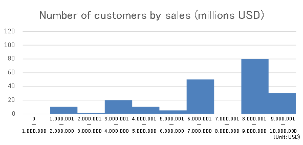
First of all, this histogram shows the “number of customers by sales” divided by sales = million USD. It’s hard to read trends because of the variability, right?

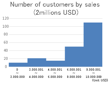
Next, this histogram is the same data as in Fig2, but it is divided into units of sales = 2 million USD. I think this makes it easier to see the trend that there are more customers with higher sales. Fig1 above is the Pareto analysis based on this histogram in Fig3.

In this way, even if the same data is used, the appearance would be changed considerably depending on the settings, so we should be careful. There are various ways to determine this bin width, but
the common way used in practice is that “Determine by subtracting the minimum value from the maximum value of the data that is the basis of the horizontal axis (sales in this case) and dividing that value by ‘5 to 10’.” Try dividing it into several patterns and choose a width that makes it easy to see the trend.
There’s also the “Sturges formula” (although I’ve never seen it actually used in practice). If you are interested, please google it.
That’s all for this time, and I would like to continue from the next time onwards. Thank you for reading until the end.