Hello everyone. Last time, I wrote about “Design of Experiments” which was introduced as one of the analysis methods when conducting primary research.
In the last few articles, I have introduced the points of analysis methods that I have been using relatively frequently. And I think it is very important for you problem solvers to present your analysis results and convince stakeholders, we can say “90% of analysis is how you present it!”. So this time, I would like to write about “how to present the analysis results”.
1. How to select a graph
Graphs are one of the best ways to show analysis results. I think everyone is using them well. But are you selecting the right graph considering what you want to show? Isn’t it just “somehow” using a vertical bar chart or a pie chart? 🙂
Personally, I organize them like this and use this as a basis for selecting a graph.
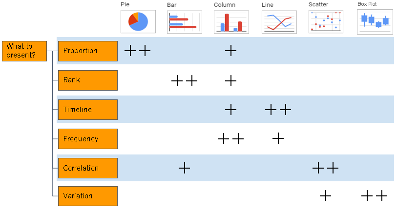
If you would like to show “proportion”, pie charts are the way to go, but if you would like to compare multiple proportions, vertical bar charts (percentages) are easier to understand. For “ranking”, it seems that there are many vertical bar graphs, but horizontal bar graphs are better. Humans tend to assume a timeline when looking at the “horizontal flow”, and it is more natural to express the “vertical flow” from the top to the bottom of the ranking. “Timeline” is fine with a column chart. However, if the timeline is long, it is easier to see it as a line graph.
Also, when looking at “variation”, I think many people are familiar with scatter plots, but there is also a “box plot”. Those who have studied Six Sigma know this well, but it may not be well known to problem-solvers who are not in Six Sigma community. Also, if I have the chance, I would like to write about “box plots” on this blog later.
2. Let’s pay attention to “details” of graphs!
After selecting an appropriate graph according to “what you would like to show”, the next step is to actually create it. At that time, don’t you select the target data on Excel and use the graph that pops up as it is? Please be careful, though Excel is very useful, it doesn’t pay much attention to details. Here are a few things to keep in mind.
1) Max and min on axes
Excel adjusts the maximum and minimum values of the axis of the graph appropriately according to the target data and outputs it. This might be misleading when comparing multiple graphs. Let’s take a look at the graph of the impact on “PC satisfaction” (by weight and by battery life) used in the previous “Design of Experiments” post.
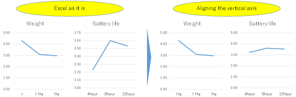
The left side is the state where the graphs output from Excel are arranged as they are. Looking at this, it seems that “Battery life” has a higher impact on satisfaction, since the variation in the line graph of “Battery life” is larger.
On the other hand, on the right side, the maximum and minimum values of the vertical axes of the “battery life” graph and the “weight” graph are corrected to be the same. Looking at this, you can see that “weight” has a greater impact on satisfaction. This is correct, isn’t it? We would like to be careful about the maximum and minimum values of axes of graphs so as not to mislead like this, wouldn’t you?
2) Units of axes
Another point is “units” of axes of graphs. There is no problem if the numbers are not so large, but for example, when expressing monetary amounts like “sales”, it would be often in millions or tens of millions. In those cases, can you see at a glance if “1000000” or “10000000” is displayed on axes of graphs? People in accounting departments may be okay:) , but I think there would be more project stakeholders who are not. At a minimum, I would like to make it “comma delimited (“1,000,000”, “10,000,000”, etc.)”. If possible, if the unit requires a comma, it would be smarter to write “1” and “10” and put (unit: million yen) near the top of the axis.
And let’s not forget the unit notation such as this “yen”. We often see graphs where only numbers are displayed, and it is difficult to tell whether it is yen, dollar, or euro. Even if it is “obvious” for the person who created the graph, from the side of the person who is shown the graph, It would be better to eliminate the elements that you cannot understand unless you ask detailed questions one by one.
3. Sometimes it is better not to force to make them graphs
I’ve written about graphs so far, but sometimes it’s better not to force to make them into graphs. For example, let’s take a look at this “Five-Year Transition of Customer Satisfaction by Branches”.


Table 1 is the original data, and Fig. 3 is a graph. Although each branch office has its own color, don’t you think it’s messy and hard to see? In such a case, I think it is better to show the table as it is without forcibly converting it into a graph. Well, this part might also be a matter of taste.
That’s all for this time, and I would like to continue from the next time onwards. Thank you for reading until the end.